


Data visualization plays a key role in business analysis. Thanks to it, we are able to formulate valuable conclusions from numerical information presented in a more accessible form. In this article, we will look at the most important ways of visualizing data in Power BI and discuss their use.
Types of data visualization in Power BI
Power BI offers a wide range of visualizations that can be customized to suit different business needs. From classic bar charts to advanced tools such as decomposition trees or geospatial maps. Depending on the nature of the data and the purpose of the analysis, users can choose the best way to present information.
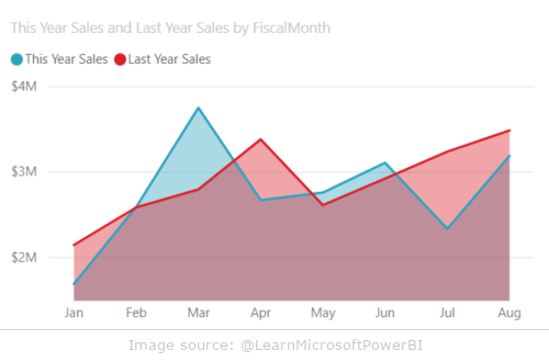
Area charts
Area charts in Power BI allow you to visualize changes in values over time. The basic version of this chart is similar to a line chart, but the space between the X-axis and the line is filled with color. These charts are especially useful when you want to show not only the trend of changes, but also their scale.
Example use of area charts:
- visualization of trends over time, e.g. company revenues
- presentation of cumulative values, e.g. market share of several products
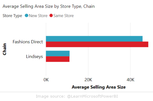
Bar and column charts
Bar charts are one of the most commonly used data visualization tools in Power BI. They allow easy comparison of values in different categories. The bars can be vertical (columns) or horizontal (bars), depending on the user’s preference.
Example use of bar and column charts:
- analysis of product sales in different regions
- comparison of the financial results of the company’s branches
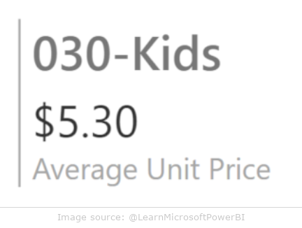
Cards
Power BI offers two types of cards: single and multi-row. Single cards display a single key value, which is especially useful in dashboards where key metrics, such as total sales, need to be clearly visible. Multi-row cards, on the other hand, allow you to present a lot of data in a single view.
Example use of cards:
- presentation of key indicators (e.g. number of customers, revenues)
- displaying detailed data for several categories at the same time
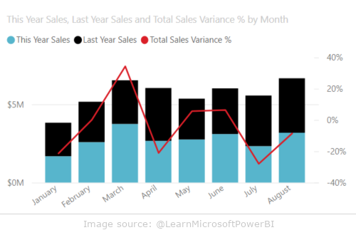
Combo charts
Combination charts combine two types of charts, most commonly column and line, allowing you to quickly compare different measures on a single X-axis. Because they can use two Y-axes, these charts are ideal for presenting data on different scales.
Example use of combo charts:
- comparison of product sales (column chart) with market trend (line chart)
- analysis of the relationship between different measures, e.g. sales and costs
Advanced visualizations in Power BI
Power BI also offers advanced visualization tools that enable deeper data analysis and interactivity. Below are some examples of these tools.
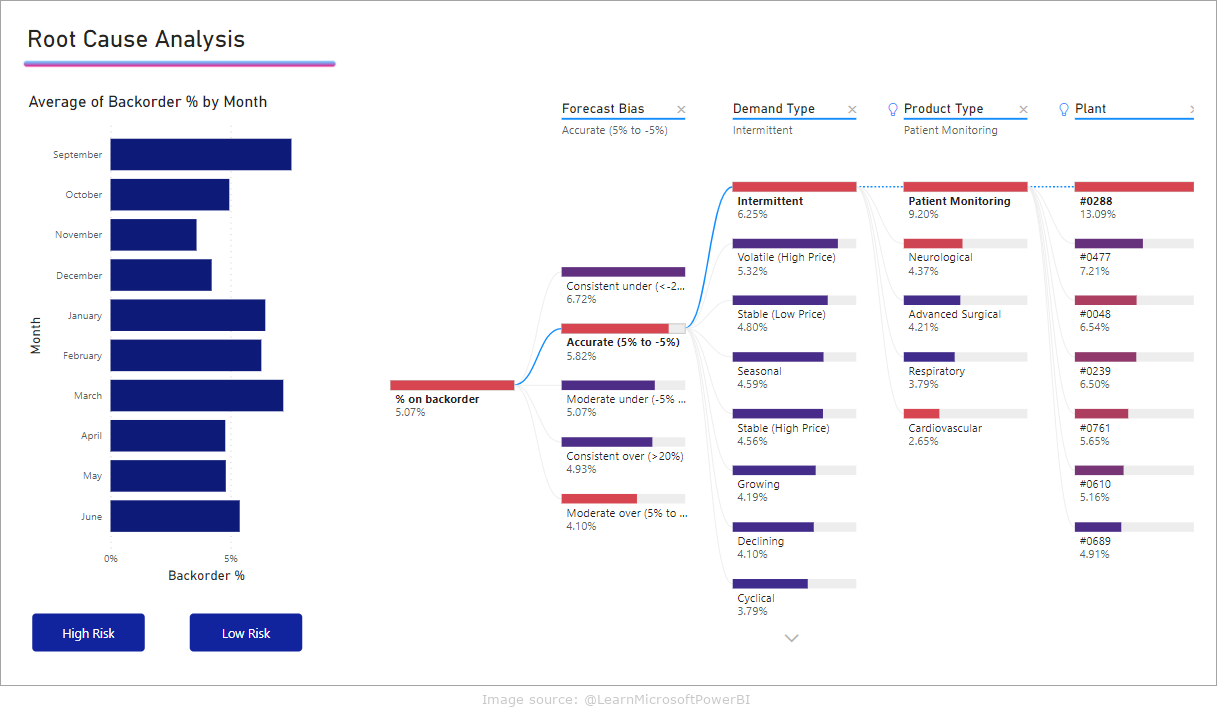
Decomposition tree
The decomposition tree is an interactive visualization that allows you to analyze data in multiple dimensions simultaneously. You can “unpack” subsequent levels of data to find the most important factors that affect a selected measure.
Example use of decomposition tree:
- analysis of the causes of problems, e.g. falling sales
- identifying key factors influencing the success of a marketing campaign
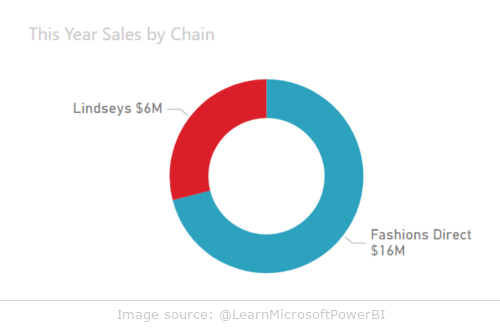
Pie and doughnut charts
Pie and donut charts are classic tools for presenting percentages of a whole. In Power BI, a donut chart differs from a pie chart only in that its center is empty, allowing you to add additional information, such as labels or icons.
Example use of pie and donut charts:
- presentation of product market shares
- visualization of the budget percentage breakdown
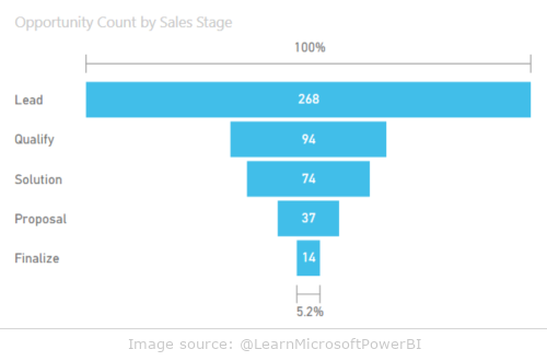
Funnel chart
Funnel charts are used to visualize multi-stage processes where each step has a different number of elements. They are most often used to track a sales process where the number of potential customers decreases at each stage of the process.
Example use of funnel charts:
- sales funnel analysis: from lead generation to closing the deal
- tracking the progress of your marketing campaign
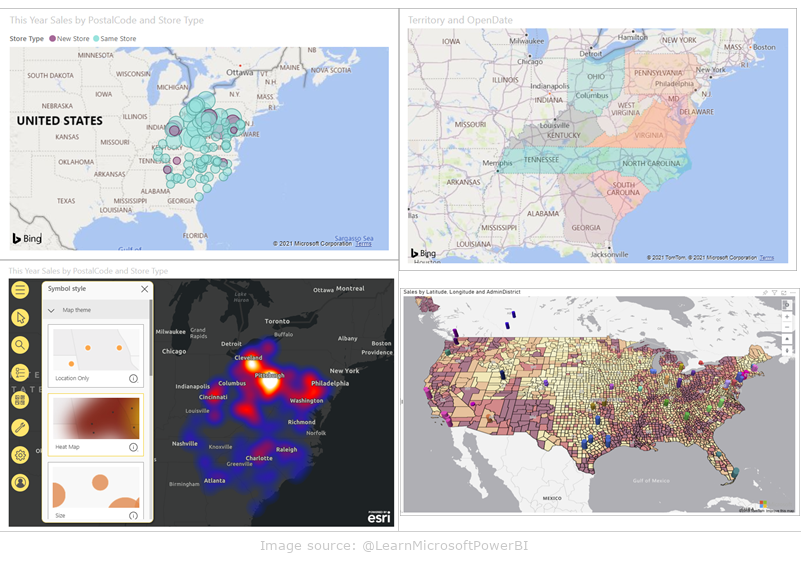
Maps
Power BI offers different types of maps, such as a basemap, choropleth map, and advanced ArcGIS (Arc Geographic Information System) map. These maps allow you to visualize data in a geographic context, which is extremely useful for analyzing location data.
Examples of use of maps:
- visualization of sales results in different regions
- analysis of geographical patterns of customer behavior
Personalization and creation of your own visualizations
Power BI also enables you to create your own custom visualizations that can be tailored to your specific business needs. Users can use existing visualizations available from Microsoft AppSource or create their own using tools like R and Python.
Advantages of creating your own visualizations:
- full control over the look and functionality of the chart
- possibility of using non-standard analytical algorithms
Summary
Power BI offers a wide range of data visualization tools that allow for effective presentation and analysis of data. Thanks to intuitive tools and personalization options, users can create advanced reports and dashboards tailored to individual needs. The choice of the right visualization depends on the nature of the data and the purpose of the analysis, and Power BI provides versatility and flexibility in this regard. If you want to learn more about how Power BI can help your company in data management, contact EBIS experts who will help you implement the best solutions!
| CONTACT