

Data visualization in Power BI
Power BI is Microsoft’s analytics platform that enables advanced data visualization and information analysis in an accessible, business-friendly format. Interactive reports and dynamic charts make it possible to quickly understand complex data sets and make informed decisions based on facts.
Interactive reports and dashboards
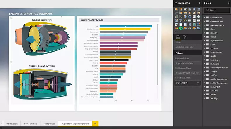
Quick access to the right information is crucial for the smooth functioning and development of a business. Power BI allows you to create reports and dashboards containing data visualizations in the form of charts and diagrams, such as:
line, column, and pie charts
maps and hierarchical visualizations
tables, matrices, and KPIs
The data presented in Power BI is updated dynamically, which means you get a real-time view of your company’s situation based on current data sources.
Dashboards enable monitoring of key metrics, quick search for answers, and ad hoc data analysis. Thanks to filters, interactions, and the ability to highlight selected elements, users can focus on the information that is most important from their perspective.
Power BI oferuje również funkcję pytań i odpowiedzi w języku naturalnym – zadane pytanie zwracane jest w formie czytelnej wizualizacji danych.
Reports and dashboards are built intuitively, by drag and drop, and there is an extensive library of modern and interactive visualizations provided by Microsoft and its partners at your disposal. You can also create your own visualization using theme, formatting and layout tools.
You can easily publish reports and analyses created in Power BI and share them with colleagues.
Collaboration through data visualization
One of the greatest benefits of Power BI is the ability to easily share reports and dashboards across the organization. Reports can be published to Power BI Service, embedded in Microsoft Teams, SharePoint sites, or internal applications.
Data visualization in Power BI becomes an element of everyday work of teams – regardless of department or location. Collaboration based on a common source of data (single source of truth) facilitates faster decision-making and eliminates misunderstandings.
What kind of visualizations can you create?
Power BI provides a library of modern visualizations that allow you to present data in the most understandable and attractive form. As part of data visualization in Power BI, you can create, among others:
- line, column and bar charts
- pie and donut charts
- heat and geographic maps
- decision trees
- waterfall and bullet charts
- interactive tables and matrices
- custom visualizations downloaded from the marketplace
Each type of visualization can be stylized and tailored to your organization’s branding.
Take advantage of EBIS help!
EBIS is a team of experts specializing in Microsoft Power BI tools. As a Microsoft partner, we have been supporting companies in the effective implementation of data analysis and visualization solutions for years. With our help:
- you will build clear reports and dashboards tailored to your needs
- you will integrate data from many sources in one place
- you will train your team in using Power BI
- you will use the full potential of data visualization in Power BI
Whether you’re just starting out or growing your analytics environment, we’ll help you make good data-driven decisions.